Crazy Crafters Blog Hop | Special Guest - France Martin
10:00:00 AM
Hi readers - thanks so much for stopping by. We have an awesome Blog Hop today - Make sure you sign up to receive my blog posts via email so you don't miss out. Click here to do it now.
We have some incredible projects to show you today. What we are MOST excited about is having the talented French (France) Martin hopping along with us. We ALMOST met Frenchie last month on the Incentive Trip in Europe. Sadly, Frenchie's daughter was injured and they had to leave (read all about it here). So, we are happy that we get to meet in the virtual realm.
Inspiration
The theme of this Blog Hop is 'Case the Designer ..... Frenchie Martin!' Here is the card of his that I have chosen to CASE (Copy and Selectively Edit);
So, what I liked about this card was the use of the window sheet with the framelit attached.
My Card
Here is the card I ended up with;
I used the Thick White card stock to give a sturdier feel to the card. I cut the frame out as shown above. I then affixed a window sheet to the rear of this. I cut out one of the sentiments in white and one in dapper denim and mounted to give a 'drop shadow' look.
How cool is the thinlit? Wanna see the rest of the pieces in the set?
I used a sheet from the 'By The Shore' designed series paper pack. There are some REALLY nice designs in this set.
I stuck it down .....
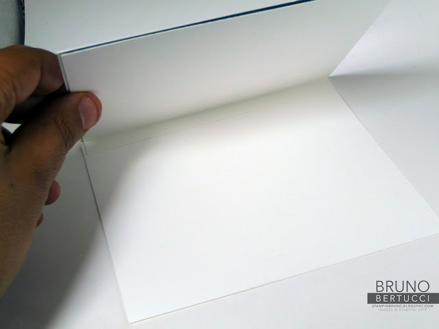
...... but then I thought 'Where is someone going to write a message?' So, Kylie gave me the idea of making a flap and writing the message below.
What do you think? I love how simple this card is - can you think of various ways you can use this idea?
Full Blog Hop Line-Up
Products Used
Do you like the framelit? I love it. Simple. Effective. This and all of the products I used can be purchased from my online store. Click on any of the images below and you can buy them now.
NOTE: Australian Residents Only
Host Code Club
The only way to describe this is FREE STUFF FOR YOU!!! Its really as simple as that.
Since its inception four months ago, we have given away more than 100 stamp sets to our valued customers. Why? They simply entered the Host Code. Its that easy!
JOIN NOW - Amazing Promotion
If your shopping list is more than $169, it is better value to join (you receive $235 of ANY products for just $169). Click here to join our team. And, now is an AWESOME time to join to take advantage of the current promotion where in addition to your starter kit, you will receive TWO FREE STAMP SETS (any value).Want to know more about me? Click here to find out.
Is there anything else we can help you with? Please email us if you need any other information or have any questions.


20 comments
Great interpetation Bruno. Angexxx
ReplyDeleteI love your take on this Bruno. I also nearly always forget to leave room for writing :) lol great remodeling to fit in a spot for the writing (high five) Awesome front panel too with the drop shadow effect !
ReplyDeleteLove your card Bruno! Especially the smaller window - I think it "invites" the recipient to see what's inside. Great case of Frenchie's card. xoxo
ReplyDeleteOh Bruno I told Kylie before the trip that it was a must to get together I wanted to meet you 2 and get a picture for this hop well sometime our plan get different direction then we plan sure hope we'll have another chance to meet thank you so much for playing and sure love your take on this perfect way to use the word cutout
ReplyDeleteJust brilliant! Can't wait to try this out.
ReplyDeleteThis is a cool card and one I'm yet to try! Love your take on it. Good job!
ReplyDeleteThis comment has been removed by a blog administrator.
ReplyDeleteGreat card Bruno, really like how you did the created the "drop" on the sentiment.
ReplyDeleteGreat idea with the flap! I'm always worried about where to write with window cards lol! Will have to have a closer look at that DSP too! xx
ReplyDeleteFabulous card and love the design - simple and so effective. Might have to CASE this one for a future project. :)
ReplyDeleteGreat idea.
ReplyDeleteSuch a great idea Bruno....
ReplyDeleteLovely Bruno! I definitely need to pop this on my CASEing list.
ReplyDeleteGreat card Bruno. I almost picked the same card to CASE.
ReplyDeletelove this card Bruno. Simple but very cool
ReplyDeleteThis is a great card, Bruno!
ReplyDeleteLove it Bruno - great card!
ReplyDeleteBeautiful Card.
ReplyDeleteOM Gosh great card Bruno
ReplyDeleteClean, simple and very classy! TFS
ReplyDelete